
Top 12 Best Data Visualisation tools for AI pros in 2026

In the world of AI and machine learning, raw data is just the beginning. The real value lies in transforming complex datasets into clear, actionable insights that drive strategy and innovation. But with a sea of options, how do you choose the right instrument for the job? This guide cuts through the noise, presenting a curated analysis of the best data visualisation tools for Australian data scientists, AI engineers, and analysts. We're moving beyond generic feature lists to provide a pragmatic roadmap for professionals at every level.
This comprehensive resource is organised to help you make an informed decision quickly. We explore everything from the enterprise-grade BI platforms like Tableau and Power BI, which are mainstays in the Sydney and Melbourne tech scenes, to the nimble open-source libraries such as Plotly and Apache Superset favoured by agile ML teams. Whether you're a recent graduate building your first portfolio or a seasoned ML engineer architecting a production pipeline, selecting the right tool is critical for both project success and career progression in the competitive Australian AI job market.
Each entry in this listicle includes a detailed breakdown with screenshots, direct links, and practical considerations. We'll analyse each tool's core strengths, integration capabilities with Python and R, and honest limitations. You will learn which platforms excel at interactive dashboarding, which are built for real-time monitoring, and which are optimised for embedding into custom applications. Our goal is simple: to equip you with the knowledge to select the perfect solution to illuminate your data and communicate your findings with maximum impact.
1. Tableau (Salesforce)
Tableau is an undisputed leader in the enterprise business intelligence (BI) and data visualisation space, making it one of the best data visualization tools for large-scale deployments. Its strength lies in transforming complex datasets into interactive and shareable dashboards with a user-friendly drag-and-drop interface. For data scientists and AI professionals in Australia, Tableau’s widespread adoption in major corporations means proficiency is a highly marketable skill. The platform excels at connecting to a vast array of data sources, from SQL databases to cloud services, and offers powerful data preparation capabilities through its Prep Builder tool.
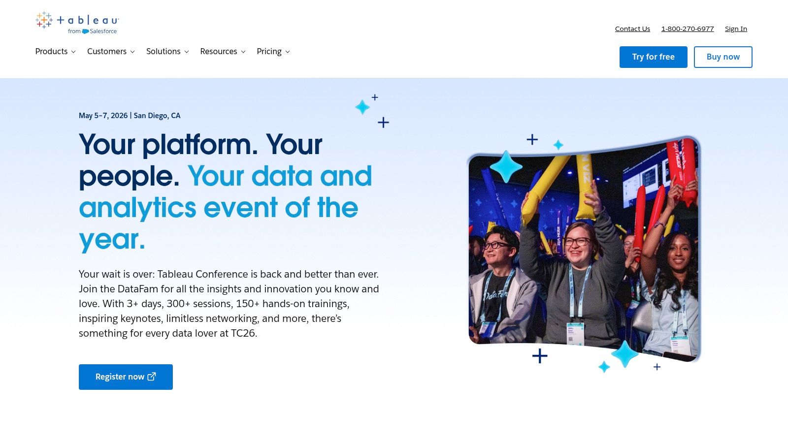
The platform’s governance features allow organisations to manage data access and security at a granular level, which is critical for compliance. Recent introductions like Tableau Pulse and Tableau+ are embedding generative AI to automate analysis and provide insights in plain language, bridging the gap between raw data and actionable intelligence. This aligns well with advanced applications, and you can explore this further by understanding what is predictive analytics and how visualisations support it.
Key Details & Use Cases
Ideal Use Case: Enterprise-wide BI, creating interactive executive dashboards, and secure data sharing across large teams.
Pricing: Role-based licensing, with Tableau Creator starting at ~$75 USD/user/month (billed annually). Cheaper Explorer and Viewer licences are available for consuming content.
Integrations: Excellent connectivity with Python and R through its Analytics Extensions API, allowing for the integration of custom models directly into dashboards.
Pros:
Extensive library of visualisations and powerful dashboard interactivity.
Mature enterprise-grade governance, security, and administration features.
Strong local support and a vast training ecosystem in Australia.
Cons:
Higher per-seat cost compared to competitors aimed at smaller businesses.
Self-hosted server deployments can require significant administrative overhead.
Website: https://www.tableau.com
2. Microsoft Power BI
As a core component of the Microsoft ecosystem, Power BI has become one of the best data visualization tools, particularly for organisations heavily invested in Azure, Microsoft 365, and Dynamics. Its primary strength is its seamless integration and accessibility, allowing users to move from data in an Excel sheet to a rich, interactive dashboard with relative ease. For data professionals in Australia, proficiency in Power BI is highly sought after, especially in roles that bridge the gap between technical data teams and business stakeholders.
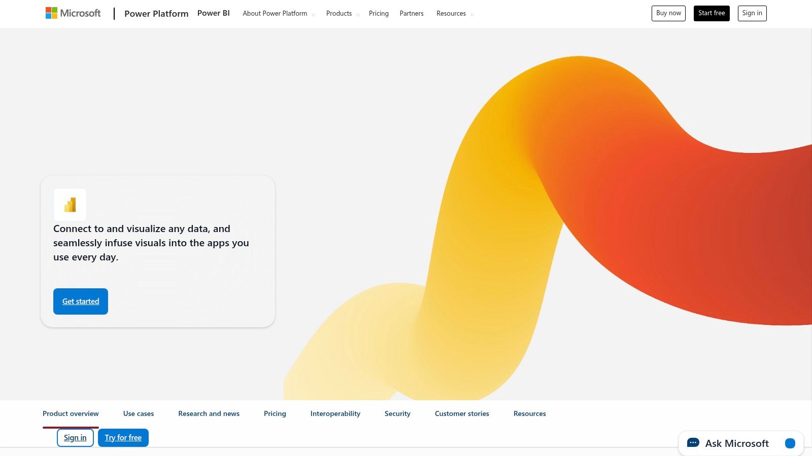
The platform offers a free authoring tool, Power BI Desktop, where users can build complex data models using the DAX language and design reports. Sharing and collaboration require a Pro or Premium per-user licence, which unlocks cloud-based workspaces, automated refreshes, and app distribution. Its native AI-powered visuals, like the Q&A feature, allow users to query data using natural language, making insights more accessible. This tool is fundamental for anyone pursuing a career as a Business Intelligence Analyst in Australia, given its widespread adoption.
Key Details & Use Cases
Ideal Use Case: Self-service BI for business departments, embedding analytics into Teams and SharePoint, and creating financial or operational dashboards for SMEs and enterprises.
Pricing: Power BI Desktop is free for authoring. Power BI Pro is ~$10 USD/user/month for sharing, while Premium Per User adds advanced features for ~$20 USD/user/month.
Integrations: Deep, native connectivity with the entire Microsoft stack (Azure Synapse, SQL Server, Fabric). Also supports Python and R scripts for custom visuals and data transformation.
Pros:
Very low cost of entry and often included in Microsoft 365 E5 licences.
Deep integration with the Microsoft ecosystem creates a unified analytics experience.
A vast library of connectors and an active, supportive global community.
Cons:
The DAX formula language has a steep learning curve for complex modelling.
Workspace governance and managing different versions can become challenging at scale.
Website: https://powerbi.microsoft.com
3. Qlik Cloud Analytics (Qlik Sense)
Qlik Cloud Analytics, often known as Qlik Sense, is a modern cloud analytics platform distinguished by its powerful associative in-memory engine. This core technology allows users to explore data freely in any direction without the constraints of query-based tools, uncovering hidden insights that might otherwise be missed. For data professionals in Australia, Qlik offers the advantage of selectable AU region hosting for its SaaS deployments, addressing data sovereignty and performance considerations. The platform is designed to be a complete solution, integrating data movement (leveraging its acquisition of Talend) and AI-assisted automation to streamline workflows from raw data to actionable visualisation.
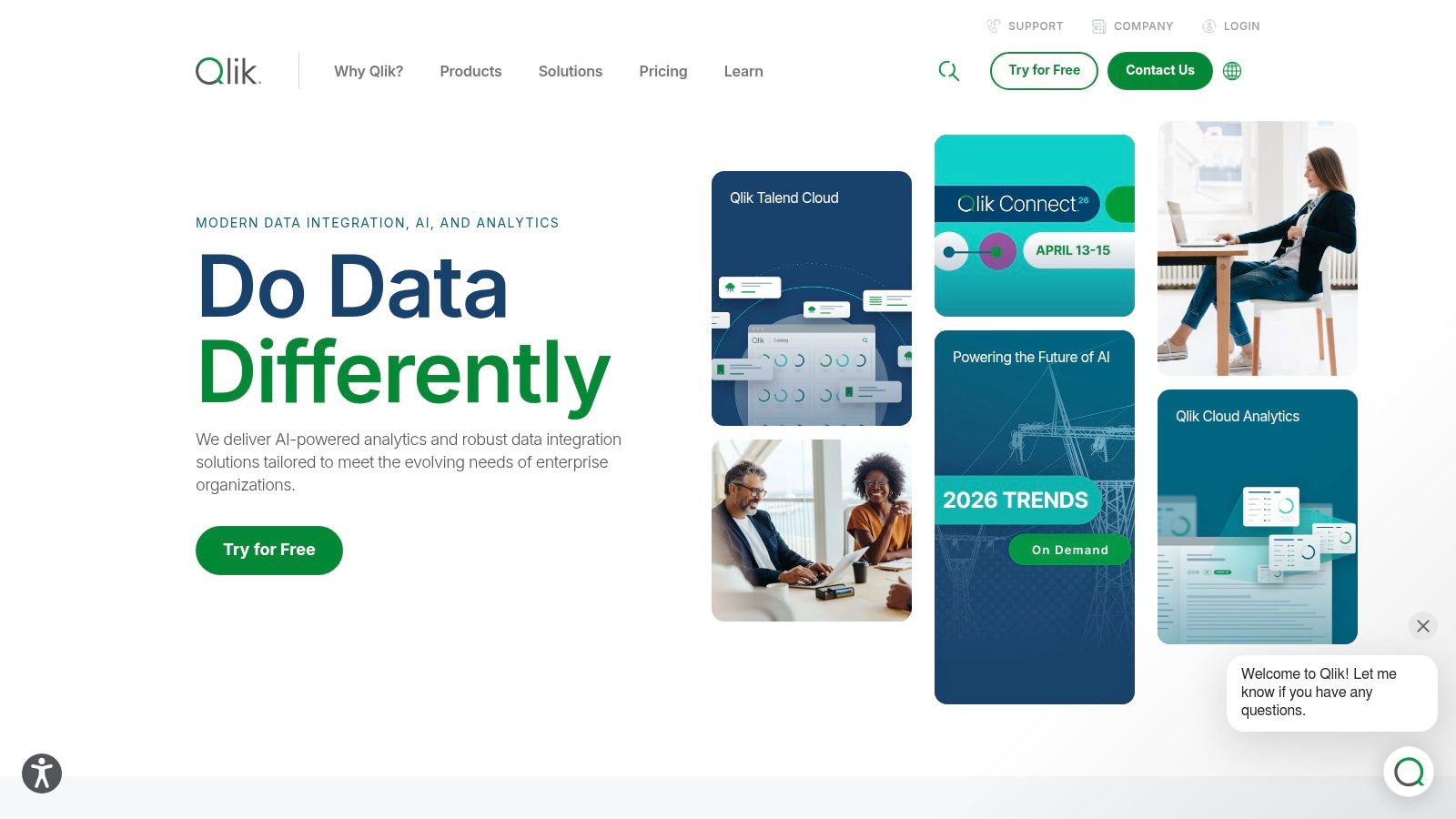
Qlik’s approach emphasises augmented analytics, where its AI provides context-aware insight suggestions and helps automate the creation of visualisations and dashboards. This makes it one of the best data visualization tools for teams looking to empower business users while maintaining robust, centralised governance. The platform’s ability to handle large datasets in memory ensures a highly responsive and interactive user experience during data exploration.
Key Details & Use Cases
Ideal Use Case: Self-service BI, exploratory data analysis, and building interactive analytic applications for business users.
Pricing: Capacity-based plans for teams, with Starter and Standard tiers offering predictable annual costs. Enterprise tiers are customised.
Integrations: Offers a server-side extension connector for Python, enabling direct integration of advanced analytics and machine learning models into Qlik applications.
Pros:
Extremely fast in-memory exploration with the unique associative engine.
Flexible capacity-based pricing model can be more predictable for teams.
AU region is selectable for SaaS deployments, a key benefit for local organisations.
Cons:
The associative model can have a steeper learning curve than traditional BI tools.
Starter plan is fixed at 25 GB of analysis capacity and may require add-ons to scale.
Website: https://www.qlik.com
4. Looker Studio (and Looker Studio Pro)
Looker Studio (formerly Google Data Studio) has carved out a significant niche as one of the best data visualisation tools for individuals and small teams, largely due to its powerful and free core offering. Its browser-based, drag-and-drop interface makes it incredibly accessible for creating and sharing live, interactive dashboards. For professionals in Australia, its seamless integration with the Google ecosystem (Google Analytics, BigQuery, Google Ads, Sheets) allows for rapid reporting and analysis without complex setup, making it a go-to for marketing analytics and startup environments.
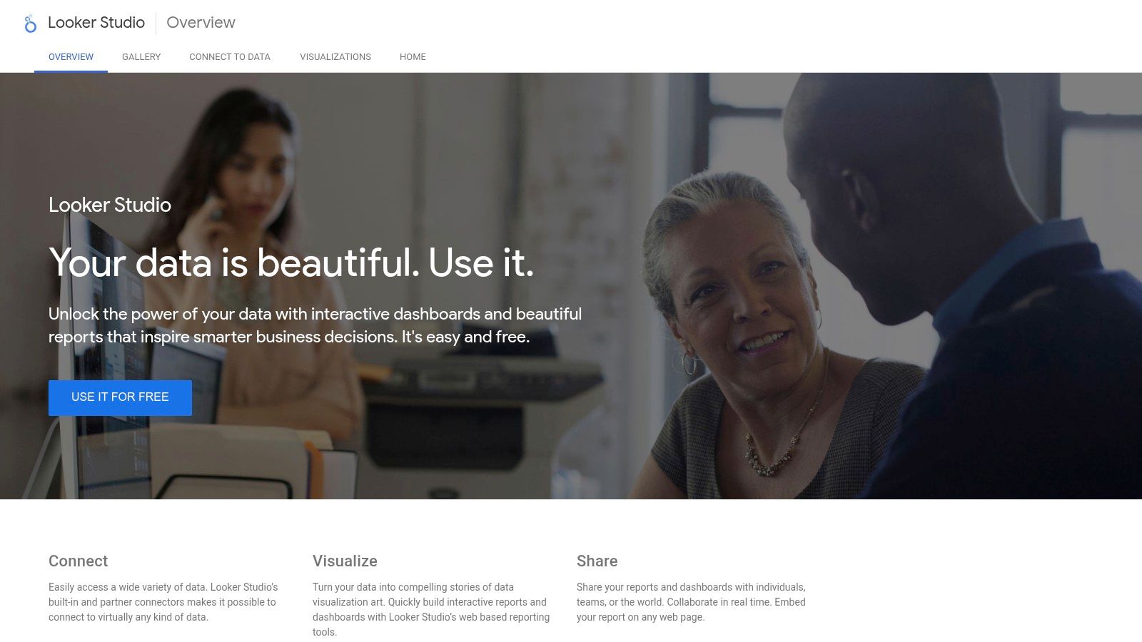
The platform’s strength is its simplicity and vast library of community-built connectors, enabling users to pull data from hundreds of sources. While the free version is perfect for individual projects, Google also offers Looker Studio Pro. The Pro version enhances governance by adding team workspaces, organisation-owned assets, and enterprise support, though it requires a Google Cloud project and its pricing is less transparent. This tiered approach allows teams to start small and scale their reporting infrastructure as their governance needs grow.
Key Details & Use Cases
Ideal Use Case: Rapid prototyping, marketing campaign dashboards, visualising data from Google ecosystem products, and creating easily shareable reports for small teams or clients.
Pricing: The core Looker Studio product is free. Looker Studio Pro pricing is tied to Google Cloud usage and is based on project and user numbers, with specific costs available via Google Cloud sales.
Integrations: Native integration with Google Cloud Platform services like BigQuery. Hundreds of partner-built connectors allow connections to databases, SaaS platforms, and other data sources.
Pros:
Completely free and highly capable core product for quick dashboard creation.
Seamless integration and sharing within the Google Workspace and Google Cloud ecosystem.
Extensive library of community and partner connectors to a wide array of data sources.
Cons:
Performance can be slow and is heavily dependent on the underlying data source and connector quality.
Advanced governance and team management features are locked behind the Pro version, which requires a Google Cloud project.
Website: https://lookerstudio.google.com
5. Amazon QuickSight / Amazon Quick (Quick Suite)
As AWS’s native business intelligence and visualisation service, Amazon QuickSight is a formidable contender among the best data visualization tools, especially for organisations heavily invested in the AWS ecosystem. Its primary advantage is seamless integration with AWS data sources like S3, Redshift, and Athena. For Australian professionals, its availability in the Sydney (ap-southeast-2) region ensures low latency and data residency compliance. The platform uses a super-fast, in-memory engine called SPICE to deliver rapid query performance on large datasets.
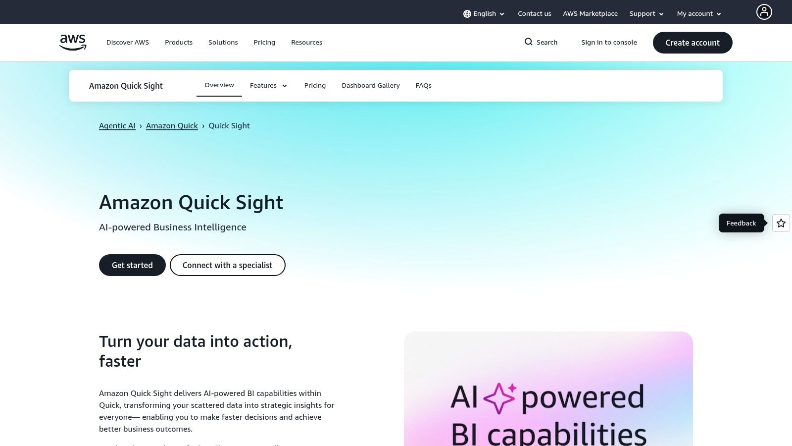
QuickSight is increasingly positioned within the broader 'Amazon Quick Suite', signalling an expansion of its capabilities. It stands out with its serverless architecture, which eliminates infrastructure management, and its embedded ML-powered insights that can automatically detect anomalies and trends. Its flexible pricing, including a per-session model, makes it highly cost-effective for embedding analytics into applications and sharing dashboards with a large, intermittent user base. This makes it a powerful choice for developers building data products.
Key Details & Use Cases
Ideal Use Case: Embedding interactive dashboards into applications, analysing data stored within the AWS cloud, and serving BI to large, fluctuating audiences.
Pricing: A multi-layered model with per-user pricing for Authors (Enterprise Edition from ~$24 USD/user/month) and capacity-based pricing for Readers, which is ideal for embedding.
Integrations: Native, high-performance connectors to the entire AWS data stack. It also supports standard sources like SQL databases and SaaS applications.
Pros:
Flexible pricing via session capacity is highly cost-effective for large audiences.
Tight integration with the AWS ecosystem and regional support in Australia.
Serverless architecture removes the need for managing underlying infrastructure.
Cons:
Pricing has multiple components (user fees, SPICE capacity, session costs) which can be complex to forecast.
The recent transition and branding shift from QuickSight to the broader Quick Suite may cause initial confusion.
Website: https://aws.amazon.com/quicksight
6. Plotly (Plotly Cloud, Plotly Studio, Dash Enterprise)
Plotly occupies a unique position by bridging the gap between open-source programmatic visualisation and enterprise-grade deployment. It is one of the best data visualization tools for teams fluent in Python or R who need to transform their data analysis scripts into interactive, production-ready web applications. Its ecosystem offers a smooth path from a simple chart created with its open-source libraries to a fully-fledged analytics app deployed via Dash Enterprise, a feature highly valued in agile development environments. This makes it a powerful choice for data scientists in Australia looking to build and share custom analytic solutions.
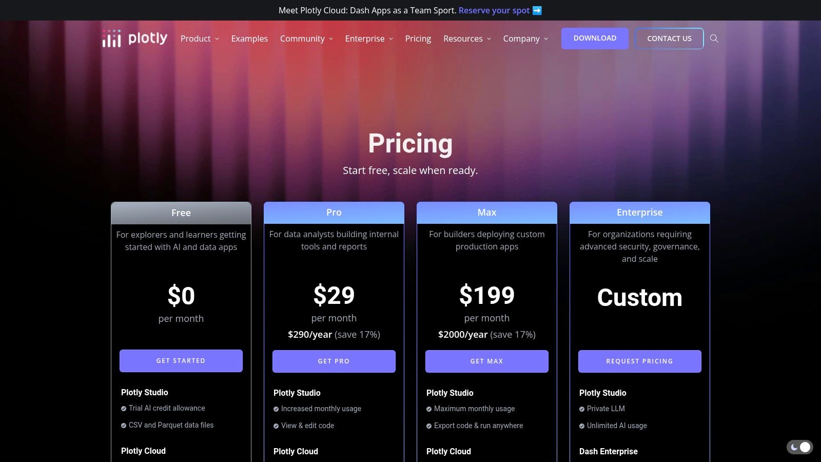
The platform consists of several key components: the core open-source graphing libraries, the no-code Plotly Studio for quick chart creation, and Dash for building the application layer. This versatility allows developers to choose their preferred workflow, from pure code to a low-code visual interface. For those deep in the Python ecosystem, Plotly's libraries integrate seamlessly with other popular tools, which you can read more about in this guide to Python libraries for machine learning. The ability to self-host or use Plotly’s managed cloud provides deployment flexibility that caters to both startups and large organisations.
Key Details & Use Cases
Ideal Use Case: Building and deploying custom, interactive web-based analytics applications and dashboards, particularly for teams with strong Python/R skills.
Pricing: The open-source libraries are free. Plotly Cloud has a free tier with limitations, with paid plans starting from ~$34 USD/user/month. Dash Enterprise pricing is available on request.
Integrations: Native and powerful integration with Python (including libraries like Pandas and NumPy) and R. Dash apps can be integrated into larger web frameworks.
Pros:
Excellent for engineers and data scientists using Python/R to build interactive analytics.
Provides a smooth, unified path from prototype script to a scalable enterprise application.
Highly customisable visualisations and robust callback functionality in Dash for complex interactivity.
Cons:
The free tier for hosted apps is limited, with concurrency caps on lower-tier plans.
Enterprise-level features and deployment require custom pricing, which can be a significant investment.
Website: https://plotly.com/pricing
7. Grafana
Grafana is the go-to open-source platform for operational intelligence, making it one of the best data visualization tools for real-time monitoring of systems and infrastructure. It excels at visualising time-series data, which is crucial for tracking application performance, server metrics, and IoT sensor data. For AI and ML engineers in Australia, Grafana is invaluable for monitoring model performance, resource utilisation of training jobs, and the health of data pipelines. Its strength lies in its ability to unify data from dozens of sources, like Prometheus, Loki, and InfluxDB, into a single, cohesive dashboard.
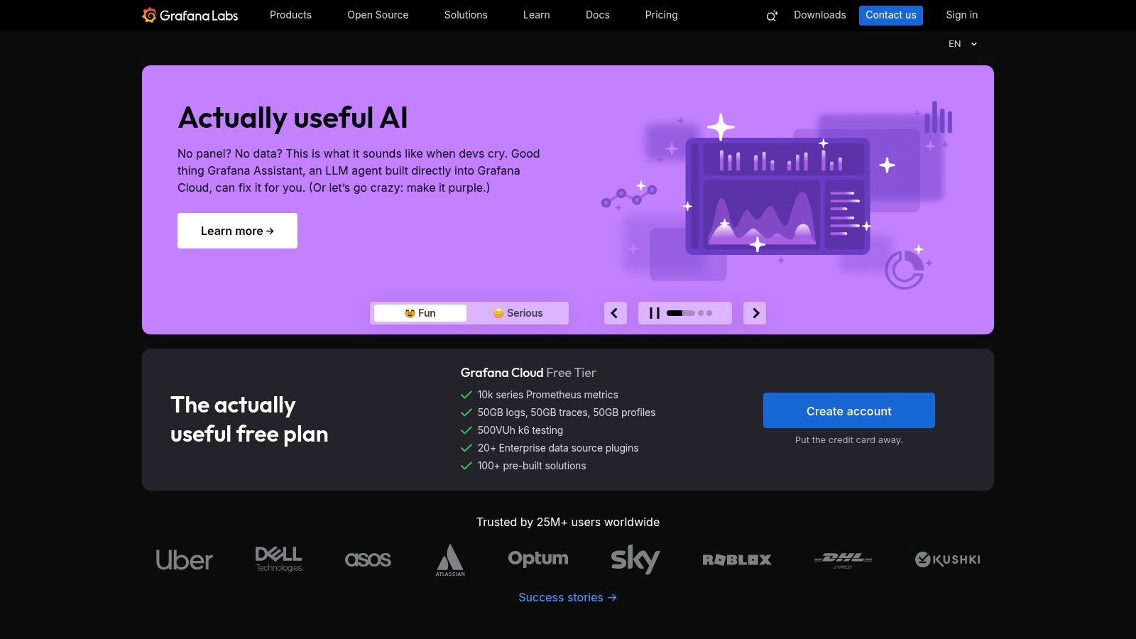
The platform is built around a powerful and flexible plugin architecture, allowing the community and organisations to extend its capabilities with new data sources, panels, and applications. While its core focus is on operational dashboards, its query and transformation capabilities allow for sophisticated analysis directly within the interface. With both a powerful self-hosted option and a managed Grafana Cloud offering with local AU regions, it provides a scalable solution from individual projects to enterprise-wide observability.
Key Details & Use Cases
Ideal Use Case: Real-time infrastructure monitoring, application performance management (APM), IoT dashboards, and MLOps performance tracking.
Pricing: A generous Free tier is available on Grafana Cloud. Pro and Enterprise plans are usage-based, scaling with metrics, logs, and active users.
Integrations: Native support for a vast ecosystem of data sources, including Prometheus, MySQL, and PostgreSQL. It integrates well into DevOps and MLOps toolchains.
Pros:
Excellent for time-series dashboards and operational monitoring.
Highly extensible with a massive library of plugins for data sources and visualisations.
Generous free tier and scalable pricing from hobbyist to enterprise levels.
Cons:
Business intelligence features like pixel-perfect reports are less developed than dedicated BI tools.
Usage-based pricing on the cloud offering requires careful monitoring to avoid unexpected costs.
Website: https://grafana.com
8. Apache Superset
Apache Superset is a modern, open-source data exploration and visualisation platform, making it one of the best data visualization tools for teams seeking flexibility and control. Its strength lies in its self-hosted nature, allowing organisations to deploy it on their own infrastructure and scale it according to their needs. For Australian tech companies and startups that prioritise customisation and cost-efficiency, Superset offers a powerful alternative to commercial BI solutions. The platform provides both a no-code chart builder and a rich SQL IDE, catering to technical and non-technical users alike.
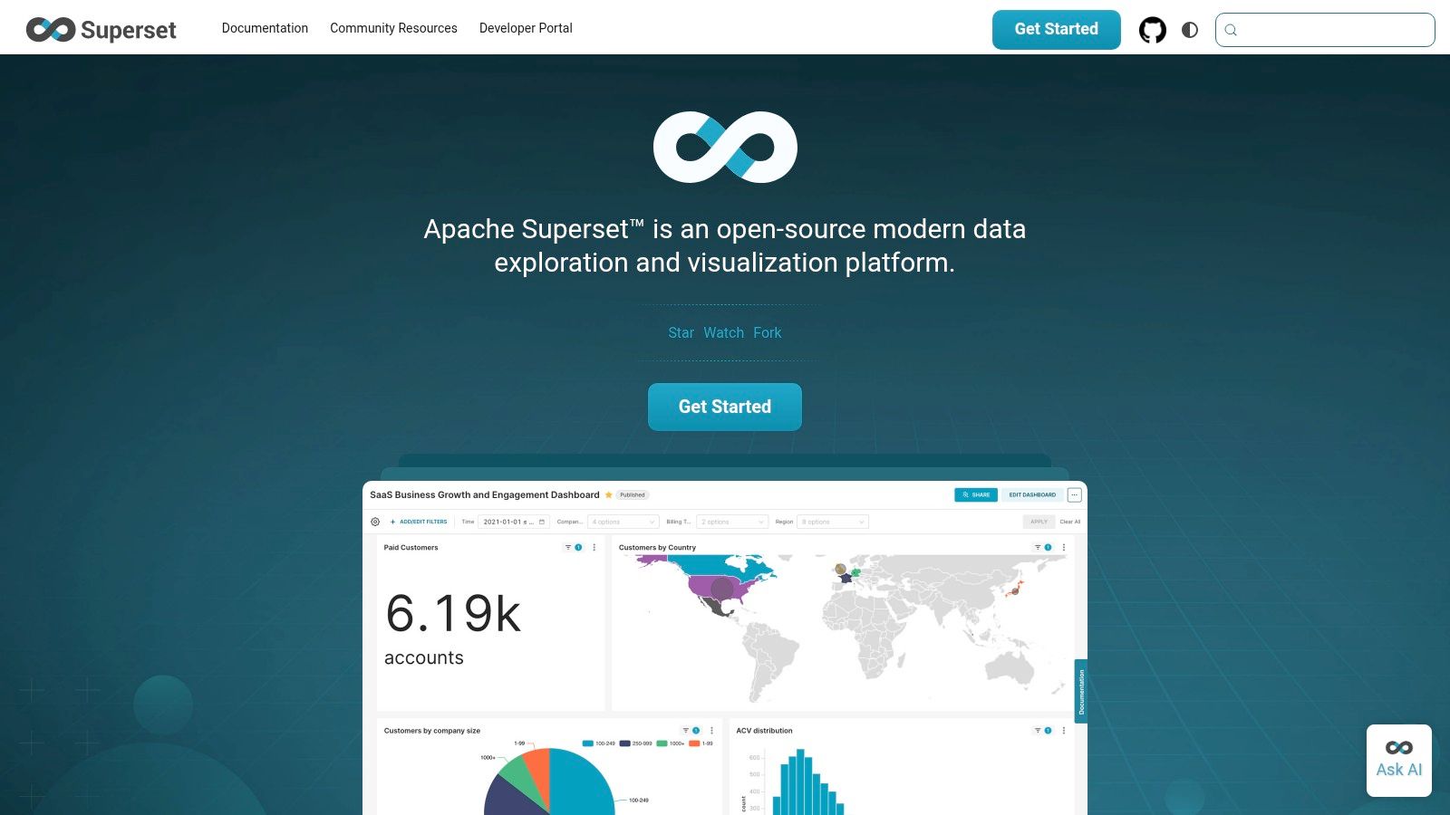
Designed to be cloud-native, Superset connects to nearly any SQL-speaking data source and is highly extensible thanks to its Apache 2.0 license. This allows data engineering and AI teams to integrate it deeply into their existing data stacks and even contribute to its development. While it requires more hands-on management for upgrades, authentication, and high availability, the trade-off is complete ownership and the absence of licensing fees, a significant advantage for budget-conscious but technically proficient organisations.
Key Details & Use Cases
Ideal Use Case: Startups and tech-forward companies wanting a customisable, self-hosted BI platform without vendor lock-in.
Pricing: Completely free and open-source. Costs are associated with your own hosting, maintenance, and infrastructure.
Integrations: Connects to most SQL databases (e.g., PostgreSQL, Snowflake, BigQuery). Its API allows for programmatic interaction, enabling integration into data pipelines.
Pros:
Free, open-source, and highly extensible with an active development community.
Gives teams full control over hosting, security, and the feature set.
Scales with your own data infrastructure, from small servers to large clusters.
Cons:
Requires significant technical expertise to set up, manage, and maintain.
Lacks the polished, turnkey business features of commercial competitors.
No official SaaS offering means you are responsible for upgrades and support.
Website: https://superset.apache.org
9. Metabase
Metabase strikes an excellent balance between user-friendliness and power, positioning itself as one of the best data visualization tools for teams who need to move quickly. It empowers non-technical users to explore data and ask questions using a simple graphical interface, while still providing a robust SQL editor for data analysts to perform complex queries. Its open-source foundation makes it a highly accessible starting point for startups and smaller teams in Australia, with a clear and affordable upgrade path to managed cloud services as the organisation scales.
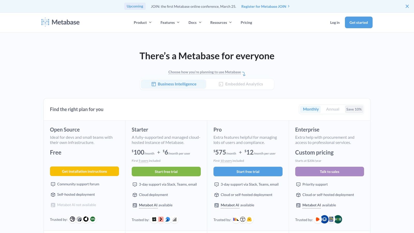
The platform is designed for rapid deployment, allowing teams to connect to their databases and build their first dashboards in minutes. Features like data modelling, caching, and embedding capabilities make it versatile for both internal BI and customer-facing analytics. The optional Metabot AI add-on further simplifies data exploration by allowing users to ask questions in natural language, making data insights more accessible across the business.
Key Details & Use Cases
Ideal Use Case: Startups and mid-sized companies needing a fast, easy-to-use BI tool for team-wide data exploration and dashboarding.
Pricing: Offers a free open-source, self-hosted version. Cloud plans start with Starter at ~$85 USD/month for 5 users, and Pro at ~$500 USD/month for 10 users.
Integrations: Connects to a wide range of popular SQL databases and data warehouses. Embedding options allow for easy integration into custom applications.
Pros:
Extremely fast time-to-value and an intuitive user interface.
Affordable pricing with a free, powerful open-source option.
Clear upgrade path from self-hosted to managed cloud and enterprise tiers.
Cons:
Advanced governance features like SAML/SCIM are reserved for higher-priced plans.
May not support the complexity of very large semantic models as effectively as heavier enterprise tools.
Website: https://www.metabase.com/pricing
10. Datawrapper
Datawrapper is a purpose-built tool designed for creating clean, responsive, and publication-ready visualisations with remarkable speed. Its primary focus is on producing charts, maps, and tables for web embedding, making it a favourite among journalists, NGOs, and analysts who need to communicate data stories clearly and effectively online. For data professionals, it serves as an excellent tool for rapid, high-quality visual outputs when the goal is communication rather than deep exploratory analysis. The platform’s philosophy centres on clarity and accessibility, ensuring charts are easily understood by a broad audience.
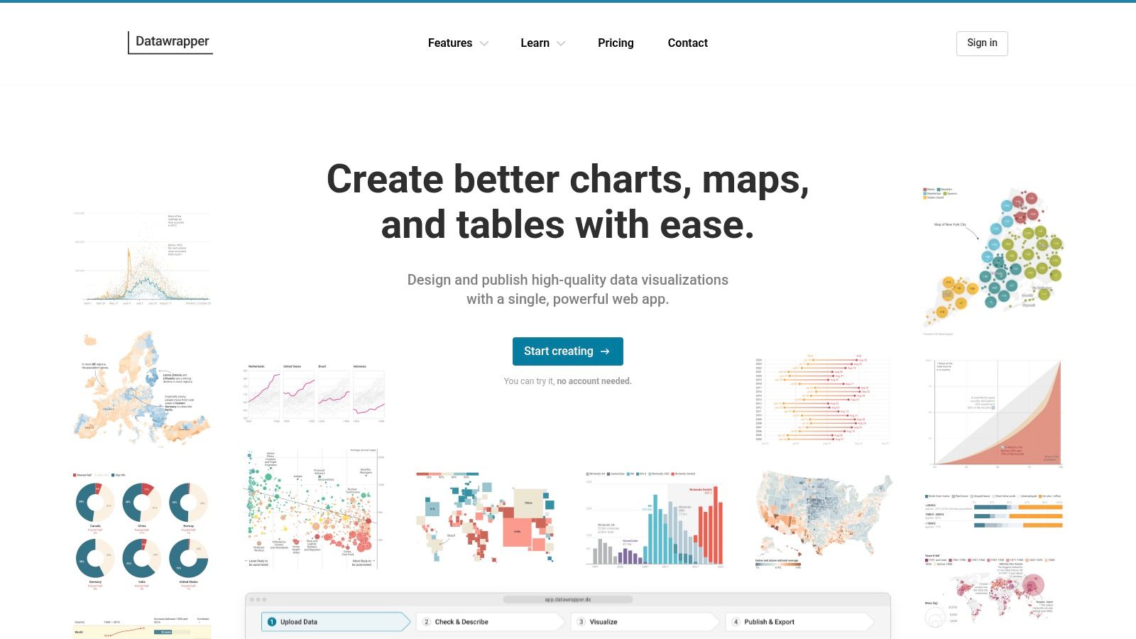
The user experience is streamlined and intuitive, guiding you through a simple four-step process: upload data, choose a visualisation type, refine and annotate, and publish. This simplicity is its greatest strength, allowing users to go from a CSV file to an interactive, embeddable chart in minutes without writing a single line of code. Its position as one of the best data visualization tools is secured by its dedication to producing web-optimised graphics that look great on any device.
Key Details & Use Cases
Ideal Use Case: Quickly creating interactive charts and maps for blog posts, news articles, and reports where clarity and web-friendliness are paramount.
Pricing: A generous Free plan allows for unlimited visualisations with Datawrapper branding. Paid plans like Custom (starting at ~$599 USD/month) offer features like PDF/SVG export and white-labelling.
Integrations: Primarily a standalone tool focused on data import via CSV or direct copy-paste; not designed for deep integration with programming languages like Python or R.
Pros:
Extremely fast and easy to produce beautiful, publication-quality visuals.
No coding required, with an interface optimised for web performance and accessibility.
Excellent free tier for individuals and small projects.
Cons:
Limited data preparation and modelling capabilities within the tool.
Not suitable for complex, multi-faceted exploratory dashboards.
Can struggle with very large datasets compared to enterprise BI platforms.
Website: https://www.datawrapper.de
11. Highcharts
Highcharts is a robust JavaScript charting library that empowers developers to build interactive and responsive data visualisations directly into web applications. Unlike all-in-one BI platforms, it is a code-first solution, making it one of the best data visualization tools for projects requiring deep customisation or embedded analytics. For developers and data engineers in Australia, Highcharts offers a powerful way to present complex data findings within custom-built software, from internal dashboards to customer-facing portals, without being tied to a specific BI ecosystem. Its primary strength is its extensive documentation and vast array of chart types, all rendered in SVG for high performance.
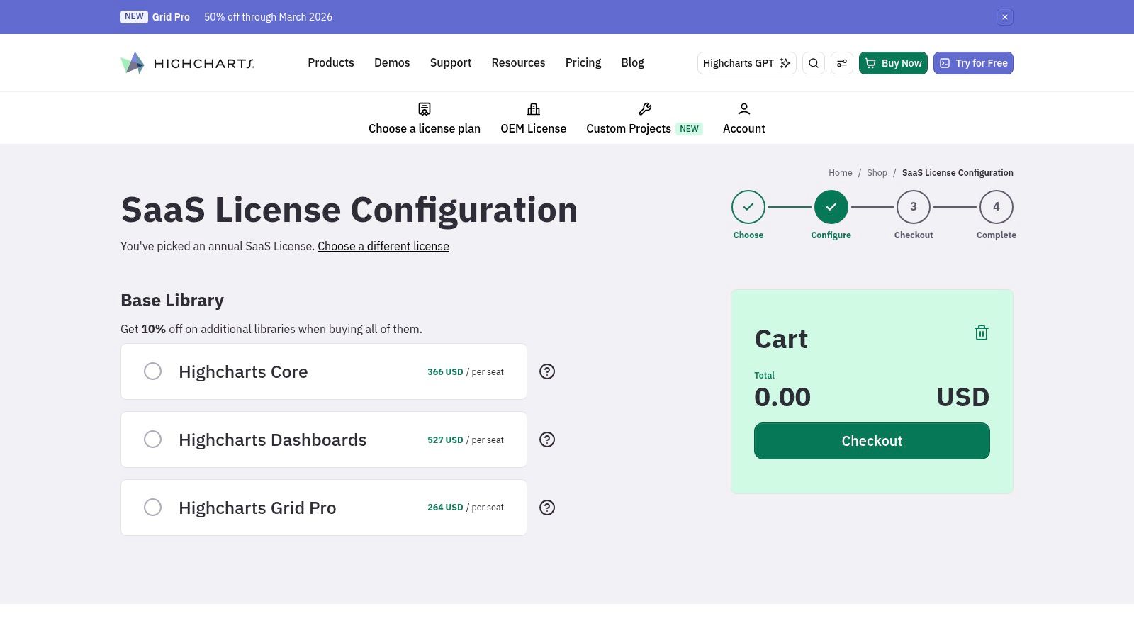
The library is designed for seamless integration, offering wrappers and compatibility with popular JavaScript frameworks. Its focus on accessibility and cross-browser support ensures a consistent experience for all users, which is critical for public-facing applications. The commercial licensing model is flexible, catering to both small internal projects and large-scale OEM deployments where visualisations are part of a sold product. This makes it a go-to choice for tech companies that need to integrate sophisticated charting capabilities into their core offerings.
Key Details & Use Cases
Ideal Use Case: Embedding custom, interactive charts into web applications, OEM products, or building bespoke analytics front-ends.
Pricing: Free for non-commercial use. Commercial licenses are required for business applications, with pricing based on developer seats and deployment type. A perpetual license with Advantage support is a common choice.
Integrations: Natively JavaScript-based, it works with any back-end that can output data in JSON format. It integrates well with frameworks like React, Angular, and Vue.
Pros:
Battle-tested performance and excellent cross-browser compatibility.
Highly customisable and extensible with a comprehensive API.
Flexible licensing for internal applications or OEM/embedded scenarios.
Cons:
Strictly a developer tool; it requires coding skills to implement and is not a no-code solution.
Pricing can be complex, as it varies by seats, usage, and support level.
Website: https://shop.highcharts.com/configure-license
12. Yellowfin BI
Yellowfin BI is a powerful business intelligence and analytics platform with a distinct Australian pedigree. Its primary strength lies in its embedded analytics capabilities, making it one of the best data visualization tools for software vendors and enterprises wanting to integrate dashboards directly into their own applications. For developers in the Australian AI and tech scene, Yellowfin offers robust white-labelling and OEM options, allowing for a completely seamless user experience under a different brand. The platform is designed for flexibility, supporting both self-managed and fully hosted deployments.
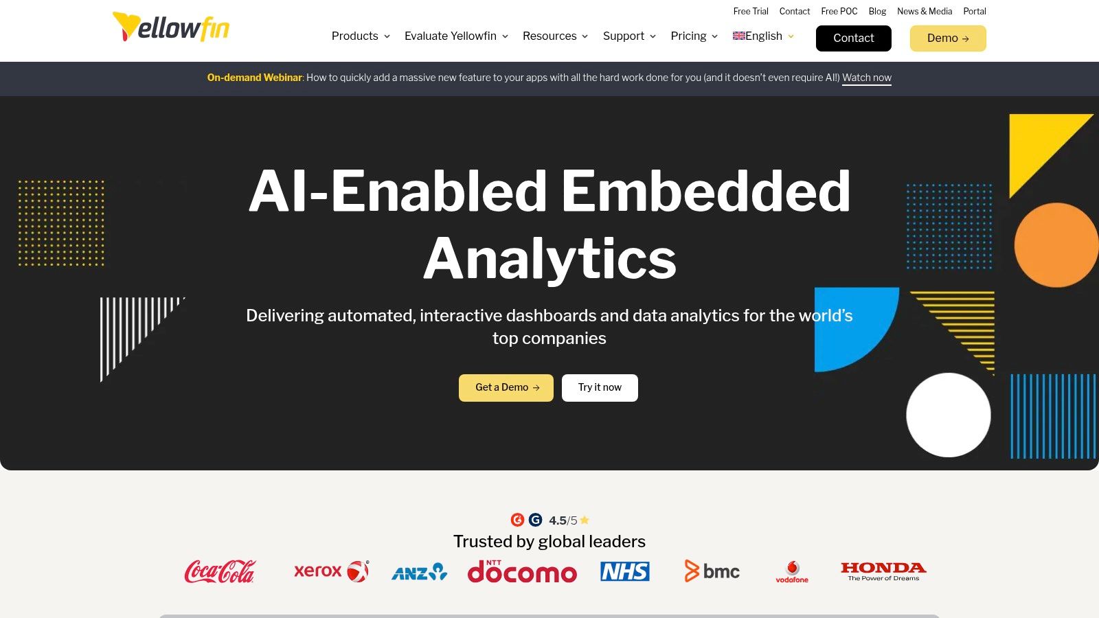
The platform's architecture is built for integration, offering a JavaScript API and simple iframe embedding to bring rich analytics into existing products with minimal friction. This focus on embedded use cases is reflected in its flexible pricing models, which are often structured around server cores, revenue sharing, or per-unit costs rather than the traditional per-user licensing common in enterprise BI. This makes it a commercially attractive option for businesses building data-driven products for their customers.
Key Details & Use Cases
Ideal Use Case: Software-as-a-Service (SaaS) companies embedding analytics into their products, enterprise-level internal applications, and white-label BI solutions.
Pricing: Customised pricing based on the use case (ISV/OEM, Enterprise). Models include server core, revenue share, and per-unit. A sales quote is required for specific details.
Integrations: Provides a comprehensive API and SDK for deep embedding and customisation, allowing developers to control the analytics experience programmatically.
Pros:
Excellent fit for OEM and embedded analytics use cases.
Strong local familiarity and a well-established partner ecosystem in Australia.
Flexible hosting and commercial models tailored to software vendors.
Cons:
Public pricing is not available; requires direct contact with sales for a quote.
Less focused on the individual analyst or small team use case compared to other tools.
Website: https://www.yellowfinbi.com
Top 12 Data Visualization Tools: Feature Comparison
| Tool | Core features | Quality (★) | Price (💰) | Target (👥) | Unique / Strength (✨🏆) |
|---|---|---|---|---|---|
| Tableau (Salesforce) | Rich visual authoring, Prep Builder, governance, Cloud/Server, AI‑assisted analysis | ★★★★☆ | 💰 Higher per‑seat | 👥 Enterprises, BI teams | ✨ Enterprise governance & broad viz types · 🏆 AU enterprise adoption |
| Microsoft Power BI | Desktop authoring, DAX modelling, Fabric/Azure & Teams integration, AI visuals | ★★★★☆ | 💰 Low entry → Pro/PPU | 👥 Microsoft shops, SMEs, analysts | ✨ Deep MS ecosystem fit · 🏆 Cost‑to‑value |
| Qlik Cloud Analytics (Qlik Sense) | Associative in‑memory engine, AI insights, capacity tiers, AU region options | ★★★★☆ | 💰 Capacity‑based (predictable) | 👥 Exploratory analysts, enterprises | ✨ Fast associative exploration · 🏆 In‑memory performance |
| Looker Studio / Pro | Free browser dashboards, 100s connectors, Pro adds IAM & org assets | ★★★☆☆ | 💰 Free core → Pro for enterprise | 👥 Google ecosystem, marketers, small teams | ✨ Free & easy embedding · 🏆 Google product synergy |
| Amazon QuickSight / Quick Suite | SPICE in‑memory, ML insights, per‑user/session pricing, AWS integration (AU) | ★★★★☆ | 💰 Flexible (user/session/infra) | 👥 AWS customers, embedders at scale | ✨ Session pricing for embedding · 🏆 Tight AWS integration |
| Plotly (Cloud / Dash) | Plotly Studio, Python/R/JS libs, Dash Enterprise for production apps | ★★★★☆ | 💰 Free tier limited → Enterprise pricing | 👥 Python/R engineers, data scientists | ✨ Prototype → production Dash apps · 🏆 Dev‑first interactivity |
| Grafana | Open‑source + Cloud, metrics/logs/traces, plugins, time‑series focus | ★★★★☆ | 💰 Free → usage‑based cloud | 👥 SRE/ops, engineering teams | ✨ Observability & plugin ecosystem · 🏆 Generous OSS tier |
| Apache Superset | No‑code chart builder, SQL IDE, extensible OSS, self‑hostable | ★★★☆☆ | 💰 Free OSS (self‑host costs) | 👥 Data engineers, teams wanting control | ✨ Extensible + SQL IDE · 🏆 Full hosting control |
| Metabase | Ask questions w/o SQL, SQL editor, embedding, OSS + managed cloud | ★★★★☆ | 💰 Free OSS → affordable cloud | 👥 Small teams, product analytics | ✨ Fast time‑to‑value, Metabot AI · 🏆 Clear OSS→cloud path |
| Datawrapper | No‑code charts/maps/tables, web embedding, focus on accessibility | ★★★★☆ | 💰 Free basic → paid exports/white‑label | 👥 Journalists, communicators, NGOs | ✨ Publication‑ready visuals & accessibility · 🏆 Fast web embedding |
| Highcharts | Commercial JS charting, many chart types, OEM/embedded licensing | ★★★★☆ | 💰 Commercial (annual/perpetual) | 👥 Developers, embedded/OEM apps | ✨ Extensive chart library & compatibility · 🏆 Battle‑tested performance |
| Yellowfin BI | Embedded analytics, white‑label/OEM pricing, managed or self‑host, AU origin | ★★★★☆ | 💰 Quote‑based / sales‑driven | 👥 ISVs, OEMs, enterprises (AU) | ✨ Embedded & white‑label focus · 🏆 Local AU pedigree |
Making Your Final Selection: Matching the Tool to Your Role and Ambition
Navigating the expansive landscape of the best data visualisation tools can feel overwhelming, but the journey from raw data to impactful insight is a core skill for any data professional. We’ve explored a dozen powerful contenders, from enterprise-grade platforms like Tableau and Power BI to open-source powerhouses like Apache Superset and developer-centric libraries such as Plotly and Highcharts. The key takeaway is that there is no single "best" tool; instead, the optimal choice is a function of your specific context, project requirements, and career aspirations.
Your decision should not be based on features alone. Consider the entire ecosystem. A Data Analyst in a large Sydney-based financial services firm will likely prioritise the robust security, governance, and enterprise-level support offered by Tableau or Qlik. In contrast, an ML Engineer in a fast-paced Melbourne tech startup might find immense value in Plotly/Dash's ability to rapidly build and deploy custom, interactive analytic applications directly from their Python environment.
Strategic Selection for the Australian Job Market
When making your choice, it’s crucial to think like a hiring manager. What skills are in high demand in the Australian AI and data science sector?
For Business Analysts and Data Analysts: Proficiency in Tableau and Microsoft Power BI is practically a prerequisite. These tools are ubiquitous in corporate Australia, and mastering one or both will significantly broaden your employment opportunities. Looker Studio also serves as an excellent, accessible entry point.
For Data Scientists and ML Engineers: While BI tools are valuable, deep expertise in programmatic libraries is a key differentiator. Plotly is a standout for its interactivity and seamless integration with Python ML workflows. Experience with tools like Metabase or Superset for quick, exploratory analysis of large datasets is also highly regarded.
For Data Engineers and MLOps Professionals: Your focus should be on scalability, real-time monitoring, and integration. Grafana is the industry standard for observability dashboards. Demonstrating your ability to deploy and manage a self-hosted solution like Apache Superset showcases valuable infrastructure skills that are sought after in data platform teams.
For a Niche Advantage: Don’t underestimate the power of specialised tools. If you're targeting roles in journalism, public policy, or consulting, expertise in Datawrapper can make your portfolio stand out. Similarly, developers who can leverage Highcharts to build custom, high-performance web visualisations possess a unique and marketable skillset.
Final Considerations Before You Commit
Before finalising your choice, ask yourself a few critical questions. What is the data literacy level of your end-users? A self-service platform like Metabase might be perfect for a tech-savvy team, whereas a curated, guided experience built in Power BI might be better for business stakeholders. Also, evaluate the total cost of ownership, which includes not just licensing fees but also the development, training, and maintenance resources required to implement and sustain the solution.
Ultimately, the best data visualisation tools are the ones that empower you to not just present data, but to tell compelling, persuasive stories with it. They are the bridge between complex analysis and actionable business decisions. Gaining proficiency in these platforms is an investment in your ability to create impact and advance your career in Australia's thriving tech landscape.
Ready to apply your data storytelling skills in a new role? Explore hundreds of opportunities for data analysts, data scientists, and ML engineers on AI Jobs Australia. It’s the nation's premier platform dedicated to connecting top talent with leading companies in the AI and data industry. Find your next challenge and build the future at AI Jobs Australia.