Use Case Diagram Mastery: Career Advantage in AI
Ever wondered how to get everyone on the same page before a single line of code is written? That’s where a use case diagram comes in. Think of it as a simple, visual map that shows exactly how someone (or something) will interact with a system to get a job done.
It's basically the script for your AI system. It outlines the cast of characters—we call them 'actors'—and what they need to accomplish, which are the 'use cases'. The beauty of it is its simplicity; it focuses purely on what a system needs to do from the outside, without getting bogged down in the how.
What Is a Use Case Diagram and Why It Matters for AI
A use case diagram is much more than just another technical drawing; it’s a powerful way to tell a story visually. It gives everyone, from the project stakeholders to the developers on the ground, a clear, shared picture of how a system is supposed to function. In my experience, establishing this shared understanding early on is one of the most critical factors in building technology that people actually want to use.
For those of us working in the AI field, these diagrams are indispensable for a few specific reasons:
Clarifying Complex Interactions: AI systems can get complicated fast, often involving multiple types of users and even other systems. A use case diagram helps untangle these webs, showing clearly who does what and why.
Defining Project Scope: By mapping out every possible user action, the diagram creates a natural boundary for the project. This is your best defence against the dreaded scope creep that can derail even the most promising initiatives.
Aligning Technical and Business Teams: It acts as a common language. Your non-technical stakeholders and your engineering team can both look at the same diagram and understand it, ensuring everyone is aligned from day one.
The Strategic Advantage in the Australian AI Market
Getting good at this isn't just a "nice-to-have" skill—it’s a real career advantage, especially in Australia's booming AI sector. With the artificial intelligence jobs in Australia market becoming more competitive, practical skills like this make a huge difference.
In fact, we've seen that resumes highlighting proficiency with use case diagrams get 28% higher callback rates from the 150+ companies we work with. Why? Because it shows employers you can think strategically and translate complex ideas—like improving document analysis or fraud detection—into a clear, actionable plan.
The diagram below gives you a feel for what this looks like in practice. It’s a simple sketch for an e-commerce site, showing how a customer interacts with the system to do things like view items or make a purchase.
This kind of visual clarity is exactly why companies across Sydney, Melbourne, and beyond value this skill so highly. It proves you can not only communicate your vision but also manage a project’s scope effectively, which is the key to delivering successful AI solutions that make a real impact.
Unpacking the Core Parts of a Use Case Diagram
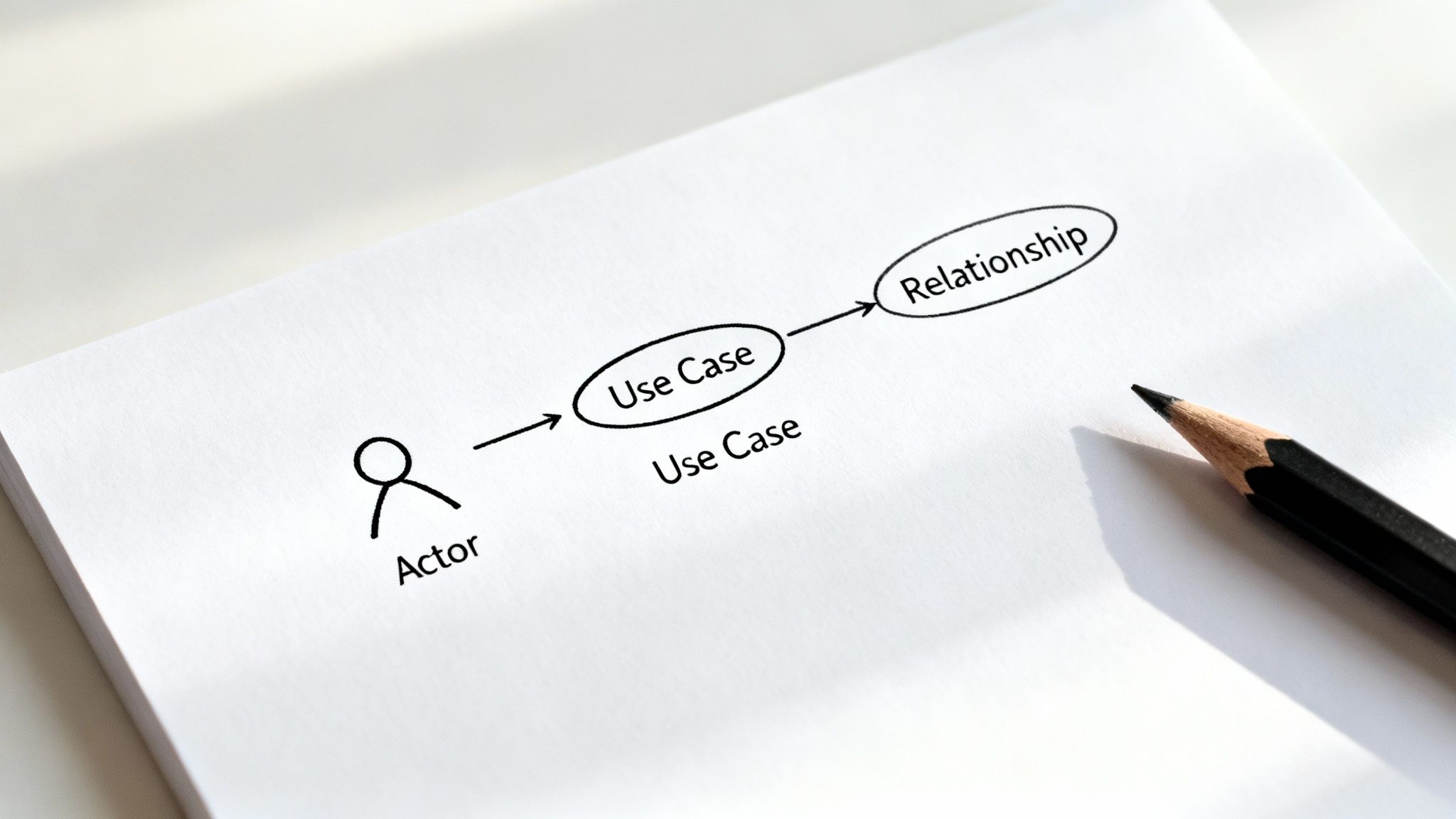
Before you can build a genuinely useful use case diagram, you need to get familiar with its three fundamental building blocks. It’s a bit like learning the key pieces on a chessboard; once you understand what each one does, you can start mapping out a winning strategy.
At its core, a use case diagram tells a story about interactions. It shows who (or what) is using a system and precisely what they need to get done. Getting these basics right is the absolute first step toward creating a clear, actionable plan for any project, especially in AI.
The Actors: Who (or What) is Driving the Action?
An Actor is any person, organisation, or even an external system that interacts with your AI system. They are the 'who' in your system's story, representing anyone or anything that has a goal to achieve. The key thing to remember is that an actor isn't part of the system itself; they exist outside of it.
In the world of AI, an actor could be a data scientist training a machine learning model, a customer getting help from a chatbot, or another piece of software, like an API that feeds real-time data into your predictive analytics engine.
We usually split actors into two main types:
Primary Actors: These are the ones who kick off an interaction with the system to achieve their main goal. A job seeker using a recommendation engine to find relevant roles is a perfect example.
Secondary Actors: These actors play a supporting role, helping the system achieve the primary actor's goal. Think of a payment gateway that processes a subscription fee—it helps the system work, but it doesn't start the interaction.
The Use Cases: Defining What Needs to Be Done
A Use Case represents a specific goal that an actor wants to achieve with the system. It's the 'what' of the diagram—the specific function or task being performed. In Unified Modelling Language (UML), the standard for these diagrams, a use case is simply drawn as an oval.
For instance, in a smart job recommender system, some key use cases would be things like:
"Upload Resume"
"Search for Jobs"
"Receive Personalised Recommendations"
Each use case should deliver a complete, observable result that offers real value to the actor. It’s not just one tiny, granular step; it's a full interaction that achieves a purpose from start to finish.
A well-defined use case should always answer the question: "What does the user want to accomplish?" It captures the functional requirements from the user's point of view, making sure the system is built to meet actual needs, not just technical specs.
The Relationships: Tying It All Together
Finally, Relationships are the lines that connect actors to use cases and even link use cases to each other. They’re the glue that holds the diagram together, showing how all the pieces interact within the system's boundary.
To get started, it's helpful to understand the core components and how they're represented.
Key Elements of a Use Case Diagram Explained
| Component | UML Symbol | Description & Role | AI System Example |
|---|---|---|---|
| Actor | Stick figure | Represents a user or external system interacting with the main system. They are the initiators or participants in a use case. | Data Analyst interacting with a predictive analytics platform. |
| Use Case | Oval | A specific function or task performed by the system that provides a measurable result of value to an actor. | "Generate Sales Forecast" is a use case initiated by the Data Analyst. |
| System Boundary | Rectangle | A box drawn around all the use cases to visually define the scope of the system being modelled. | A rectangle enclosing all functions of the "Predictive Analytics Platform." |
| Association | Solid line | A simple line connecting an Actor to a Use Case, showing that the actor participates in that use case. | A line connecting the Data Analyst to "Generate Sales Forecast." |
Include <<include>> |
Dashed arrow with <<include>> |
A relationship where one use case (the base) must include the functionality of another (the included) to be complete. | "Generate Sales Forecast" <<include>> "Authenticate User." |
Extend <<extend>> |
Dashed arrow with <<extend>> |
A relationship where one use case (the extension) provides optional functionality to another (the base). | "Generate Sales Forecast" could <<extend>> with "Apply Custom Data Filter." |
These elements work together to create a simple yet powerful visual map of your system's functionality. Getting comfortable with them is the first step to mastering use case diagrams.
Integrating Diagrams into Your AI Project Lifecycle
Knowing the building blocks of a use case diagram is one thing. But knowing precisely when to pull it out of your toolkit during a project? That’s what separates theory from real-world impact. These diagrams aren't a one-and-done task; they’re a living document that delivers its biggest value at a few critical points in the AI project lifecycle.
Their time to shine is right at the beginning, during the requirements gathering phase. This stage is often a murky soup of ideas, where business stakeholders have a vision but the technical teams need something concrete to build. A use case diagram acts as a perfect bridge, translating those high-level business goals into a visual map everyone can point to and agree on.
This simple act of visual alignment helps head off one of the most notorious project killers: scope creep. By drawing a clear line in the sand around the system and defining every user interaction, the diagram establishes exactly what's in and what's out. It keeps the team focused on building what was actually agreed upon.
Scoping for a Minimum Viable Product (MVP)
When you're launching a new AI or machine learning feature, you almost always start with a Minimum Viable Product (MVP). Use case diagrams are fantastic for carving out what that initial release will look like. They force the team to prioritise which features deliver the most immediate value to the most important actors.
Imagine a data scientist building a new analytics dashboard. They can use a diagram to map out the absolute must-have interactions for version one. What does a user need to be able to do?
Log in and authenticate.
See a default dashboard.
Apply one basic filter.
Anything else—like exporting custom reports or setting up complicated alerts—can be clearly marked as out-of-scope for the MVP and added to the backlog for later. This clarity ensures the initial product is lean, focused, and actually gets delivered on time. Because it's a visual diagram, these scoping decisions are transparent to everyone, from the project manager to the junior dev.
By focusing on user goals rather than a list of technical features, a use case diagram keeps the project centred on delivering genuine value from day one. It’s about building something people actually need.
A Communication Tool for Cross-Functional Teams
In any complex AI project, you have a mix of specialists who need to be on the same page: data scientists, ML engineers, UX designers, and business analysts. The use case diagram becomes their shared language, a single source of truth about how the system is supposed to behave.
For a solutions architect, for example, the diagram is a foundational document. It informs how they design a system architecture that can actually support all the required user interactions. For anyone aiming to move into these kinds of strategic roles, mastering tools that facilitate clear communication is non-negotiable. You can see just how valuable these skills are by exploring career paths for a solutions architect in Australia.
At the end of the day, weaving use case diagrams into your workflow is about more than just ticking a documentation box. It’s a strategic move that brings clarity, tames scope, and keeps a diverse team pulling in the same direction.
How to Build Your First AI Use Case Diagram
Creating your first use case diagram can feel a bit daunting, but at its heart, it’s just about telling a story. It’s a visual narrative of how someone (or something) will interact with your system. We’ll walk through the process together, using a "Smart Job Recommender System" as our real-world example—something anyone in the AI space can relate to.
Let's start mapping out the system's story.
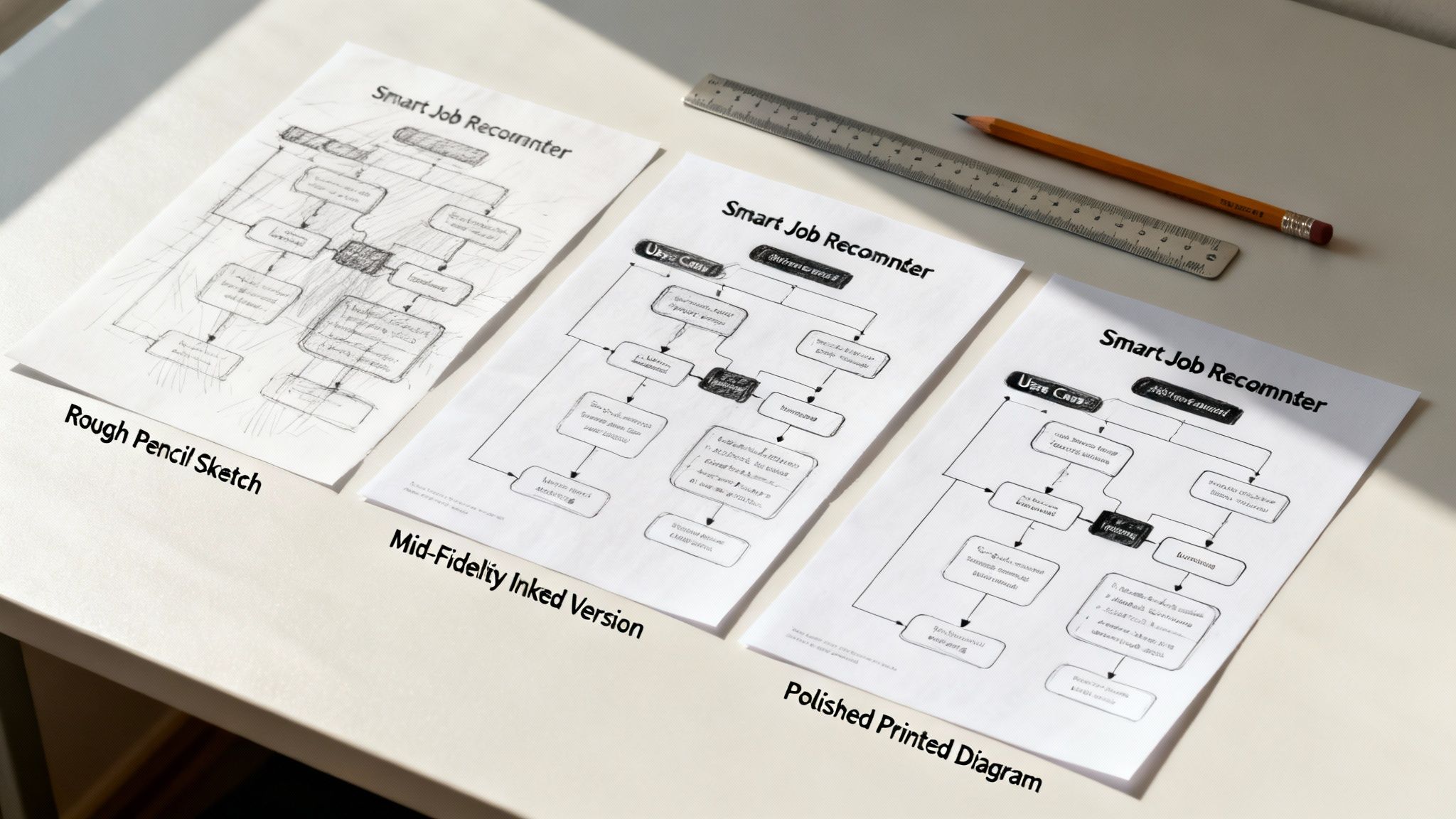
This whole process boils down to five straightforward steps. Follow this checklist, and you’ll go from a blank canvas to a crystal-clear diagram that's ready for your next project meeting or to be popped into your portfolio.
Step 1: Define the System Boundary
First things first, draw a big box. That's it. This rectangle is your system boundary. It creates a clear visual line between what's inside your system and what's in the outside world.
For our "Smart Job Recommender System," any action the platform itself performs goes inside this box. Everything else—users, external software—stays on the outside, looking in. It seems almost too simple, but this step is fundamental for setting your project's scope and stopping a world of confusion down the track.
Step 2: Identify Your Actors
Next up, let's figure out who our actors are. Who, or what, is going to be interacting with your system? In UML, actors are the little stick figures you see hanging around outside the system boundary.
For our job recommender, we can easily identify a few key players:
Job Seeker: Our main user, the person looking for cool AI roles.
Hiring Manager: The one on the other side, posting jobs and sifting through profiles.
System Administrator: The behind-the-scenes person who manages accounts and keeps the lights on.
External Job Board API: This one's not a person, but another system that will feed job listings into our platform. It's a secondary actor.
Getting your actors right is a core skill for anyone in roles like an AI solution designer in Australia, because it directly shapes how the system needs to be built.
Step 3: Pinpoint the Use Cases
Alright, now for the main event. What do these actors actually want to do? Their goals are your use cases, which you’ll draw as ovals inside the system boundary. The trick here is to put yourself in each actor's shoes and think about what they need to achieve.
From the Job Seeker’s perspective, the essentials are pretty clear:
Create Profile
Upload Resume
Search for Jobs
Receive Job Recommendations
And for the Hiring Manager, their goals are different:
Post a Job Listing
Search for Candidates
Each of these ovals should represent a complete, meaningful goal for the actor.
Here's a pro tip: A good use case delivers a tangible result. "Search for Jobs" is a complete action. "Enter Keyword" isn't a use case; it's just one small step in the process. Always focus on the actor's ultimate objective.
Step 4: Map the Relationships
Now that you have your actors and use cases laid out, it's time to play connect-the-dots. Draw solid lines, called associations, from each actor to the use cases they interact with. The Job Seeker connects to "Search for Jobs," the Hiring Manager connects to "Post a Job Listing," and so on.
This is also where you can get a little more sophisticated by adding <<include>> and <<extend>> relationships. For example, maybe both "Create Profile" and "Post a Job Listing" must <<include>> a "Verify Email" step. This shows a required function that’s shared between them.
Step 5: Review and Refine
Finally, take a step back and look at your handiwork. Does the diagram tell the system's story clearly? More importantly, could someone who isn’t a tech expert look at it and understand what’s going on?
Show it to a colleague or a stakeholder and ask for their thoughts. This feedback loop is what turns a rough sketch into a genuinely useful tool that gets everyone on the same page. Your finished diagram is now a proper blueprint for development.
Real-World AI and Machine Learning Examples
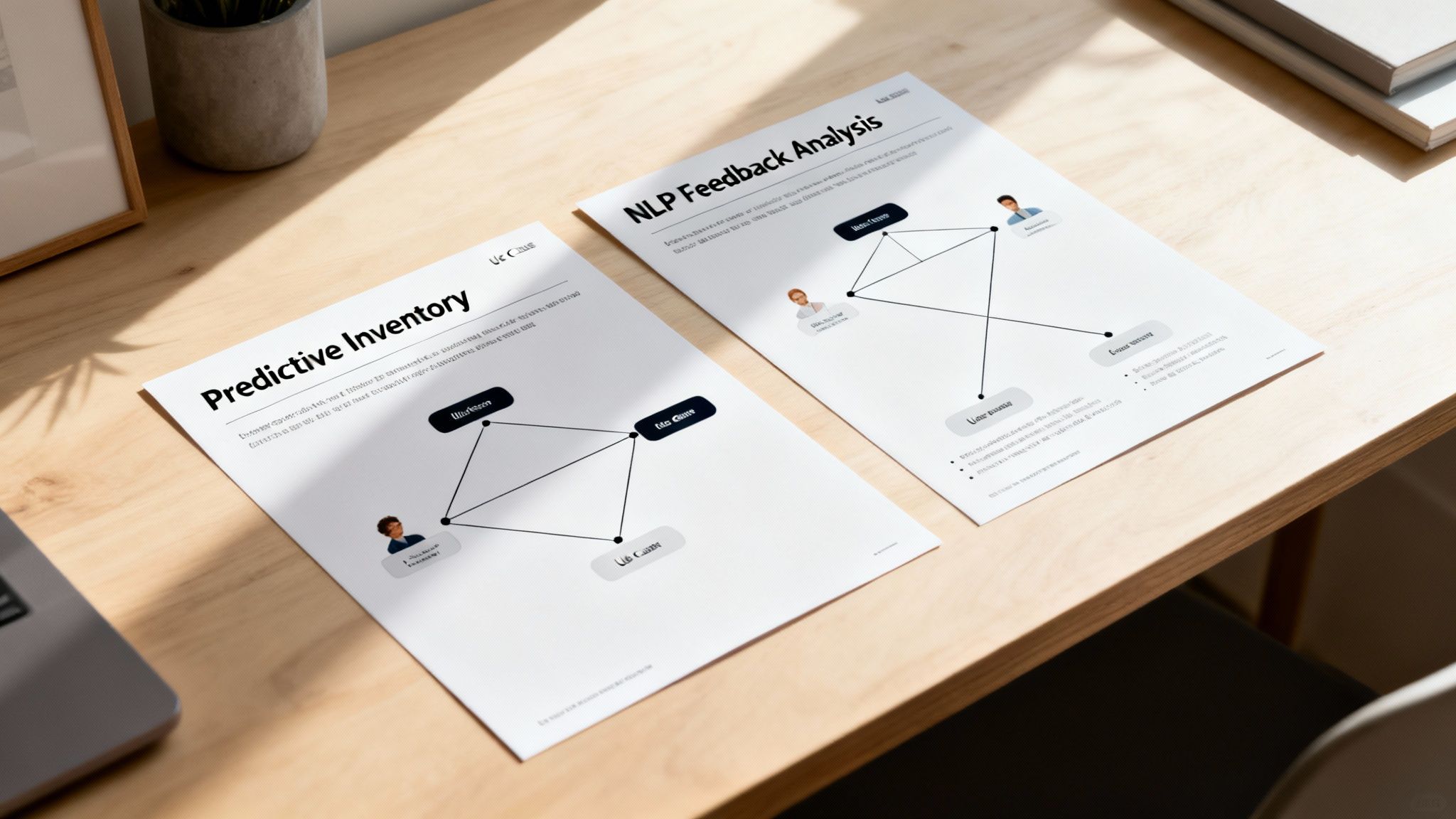
Theory is one thing, but seeing a use case diagram in action is where it all clicks. Let’s walk through a couple of real-world scenarios to show how these diagrams can turn complex AI project requirements into a clear, shared roadmap for the entire team.
Think of these examples as practical templates you can borrow from. They'll give you a solid idea of how to map out system behaviour for some pretty sophisticated AI and machine learning applications.
Predictive Analytics for Retail Inventory
Picture a large Australian retailer constantly grappling with stock levels. They want to develop an AI-powered system that can predict product demand, helping them cut down on costly overstocking and frustrating stockouts. A use case diagram is the first step to figuring out who needs to interact with this system and what they need to achieve.
We can identify a few key actors and their goals:
Inventory Manager (Primary Actor): This person’s core job is getting accurate stock forecasts. They need to see predicted sales trends, maybe tweak a few model parameters, and get alerts when stock is running low.
Data Scientist (Primary Actor): Their world revolves around training and fine-tuning the prediction model. They'll need to upload new sales data, kick off model training scripts, and check how accurate the forecasts are.
Supplier API (Secondary Actor): This isn't a person, but an external system. It automatically pushes updated product availability information into the dashboard, keeping the data fresh.
By mapping it out this way, the diagram makes the distinct needs of each user crystal clear. It ensures the final dashboard isn't just a clever bit of tech, but a genuinely useful tool for everyone, from the manager on the floor to the data team in the back office.
NLP Model for Customer Feedback Analysis
Now, let's think about a telco company drowning in customer support tickets and online reviews every single day. They need a Natural Language Processing (NLP) model to sift through it all, automatically sorting feedback by topic and sentiment (positive, negative, or neutral). The goal? Spot urgent problems much, much faster.
The AWS report, Unlocking Australia’s AI Potential, points out that 58% of Australian businesses are still focused on basic AI like chatbots. A use case diagram is absolutely essential for planning more advanced systems like this NLP model, which can seriously move the needle on customer service. You can read more about how Australian businesses are adopting AI and the massive potential behind these strategies.
Here’s a simplified breakdown of the diagram:
Customer Support Agent (Primary Actor): They need a dashboard that shows them neatly categorised feedback and sentiment scores, so they can prioritise who to help first.
Product Manager (Primary Actor): This person uses the system to find patterns. They want to identify recurring product complaints or popular feature requests by searching through the analysed feedback.
External Review Platform (Secondary Actor): Again, not a person. This is an API that pipes new customer reviews straight into the NLP model for ongoing analysis.
By visually separating these user stories, the development team can build a targeted solution that directly addresses the pain points of each stakeholder. The use case diagram ensures the final NLP system is not just technically sound but genuinely useful.
Common Mistakes to Avoid and Best Practices to Follow
Crafting a good use case diagram is as much an art as it is a science. It's easy to get it wrong, and a confusing diagram can create more problems than it solves. Many teams, even experienced ones, fall into the same predictable traps that turn a potentially helpful tool into a source of frustration.
One of the biggest mistakes is cramming in too much detail. Think of a use case diagram as the back-of-the-napkin sketch of your system's functionality—it's meant to give you the big picture. It’s not the place for documenting every last validation rule, UI element, or database query. The moment you start mapping out API endpoints, you’ve gone too far. The goal is to show what the system does, not how it gets it done.
Another classic error is getting the naming conventions wrong. It might seem small, but it makes a huge difference. Use cases should always start with a strong verb, like "Generate Report" instead of something vague like "Report Generation." This simple tweak keeps the focus squarely on what the user is trying to achieve, making the entire diagram instantly clearer for everyone involved, especially folks outside the engineering team.
Creating Clear and Effective Diagrams
So, how do you make sure your diagram is a genuine asset? The key is to embrace simplicity and follow a few common-sense rules.
Keep It Simple: Your diagram should only show the most important interactions. If it starts looking like a plate of spaghetti, you’ve definitely overcooked it. A great diagram is one you can understand in a single glance.
Work Together: Don't be a lone wolf. Get your diagrams in front of business analysts, other developers, and stakeholders early and often. This ensures everyone is on the same page and that your diagram actually reflects what the business needs.
Focus on the Goal: Every single use case must represent a complete, meaningful goal for an actor. If it doesn't deliver a clear result for the user, it’s probably just a single step in a much larger process and shouldn't be its own use case.
When you prioritise clarity over complexity, you’re not just drawing boxes and lines; you’re building a bridge between business requirements and the technical solution. A simple, well-defined use case diagram gets the whole team aligned on what the system is supposed to do, and that shared understanding is absolutely crucial for any project's success.
Your Top Questions About Use Case Diagrams, Answered
Even after getting the hang of use case diagrams, a few common questions tend to surface when you start applying them to real-world projects. Let's tackle some of those sticking points so you can build your next diagram with confidence.
How is This Different From a Flowchart or Sequence Diagram?
This is probably the most common point of confusion. What makes a use case diagram different from other visual models like user flows or sequence diagrams?
Think of it this way: a use case diagram gives you the 30,000-foot view. It’s the "table of contents" for your system's functionality, showing you what the system can do from an external perspective. It lists all the possible goals a user might have.
On the other hand, a user flow or a sequence diagram gets into the weeds. They map out the step-by-step process of how a specific goal is actually achieved. They're all about the nitty-gritty details of a single interaction.
A use case diagram shows the "what" (e.g., a user can "Purchase Ticket"), while a sequence diagram shows the "how" (the specific back-and-forth messages between the user, the server, and the payment gateway to complete that purchase).
Can I Use This to Model Machine Learning Logic?
Another great question is whether you can use these diagrams to map out the internal logic of a machine learning algorithm. The short answer is no, and that’s intentional.
Use case diagrams are strictly about external behaviour. They focus on what an actor can ask the system to do and what value they get in return.
The complex inner workings of an ML model—like how a recommendation engine crunches data to generate suggestions—is an implementation detail. That belongs in more technical documentation, like architectural diagrams or detailed flowcharts. The use case diagram keeps it simple: it just needs to show that an actor can "Receive Recommendations."
What Are the Best Software Tools for This?
Okay, so what should you use to actually draw these things? A whiteboard sketch is fantastic for hashing out ideas with the team, but for proper documentation, you’ll want something a bit more polished.
Thankfully, there are plenty of excellent tools out there, suiting different budgets and team styles.
Here are a few popular choices:
Lucidchart: A brilliant web-based tool that's incredibly easy to pick up, with a massive library of templates.
Creately: Another great online option that's particularly strong on team collaboration and has some clever automation features.
draw.io (now diagrams.net): This one is completely free and surprisingly powerful. It also plays nicely with Google Drive, Confluence, and other platforms.
Ultimately, the best tool is the one your team feels comfortable with. The key is finding something that helps you communicate ideas clearly, not just create a pretty picture.
Ready to map out your next career move? On AI Jobs Australia, we connect top talent with Australia's leading AI companies. Find roles that match your skills and ambitions today. Explore AI jobs on aijobsaustralia.com.au